
A step cut has nowhere to hide. A brilliant cut throws so much light that the eye forgives a great deal; an emerald or an Asscher is a set of long, flat mirrors, and every one of them reports honestly on the stone, the setting and the metal around it. That makes step cuts a pleasure to design and unforgiving to photograph badly. The two rings here are a small capsule built on one idea — a step-cut solitaire on a knife-thin band, with a halo concealed beneath the stone — resolved twice, as a rectangular emerald cut and as a square Asscher, and presented in rose, white and yellow gold. Twelve images in total. This is what that set is for, why the metals have to be right rather than merely attractive, and why it comes from two CAD models instead of two photo shoots.
Two step cuts, one design language
Both rings share a vocabulary: a slim round band, a centre stone held clear of the finger, and a row of small diamonds set beneath the girdle where only a side view will find them. What changes is the stone and the head that holds it.
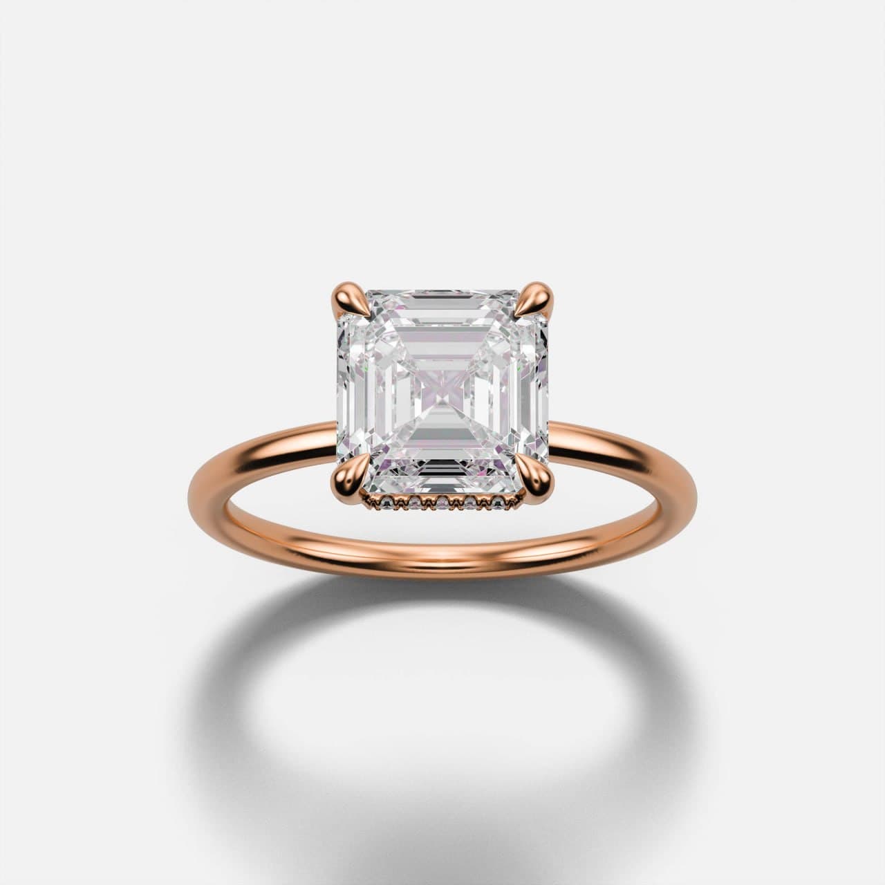
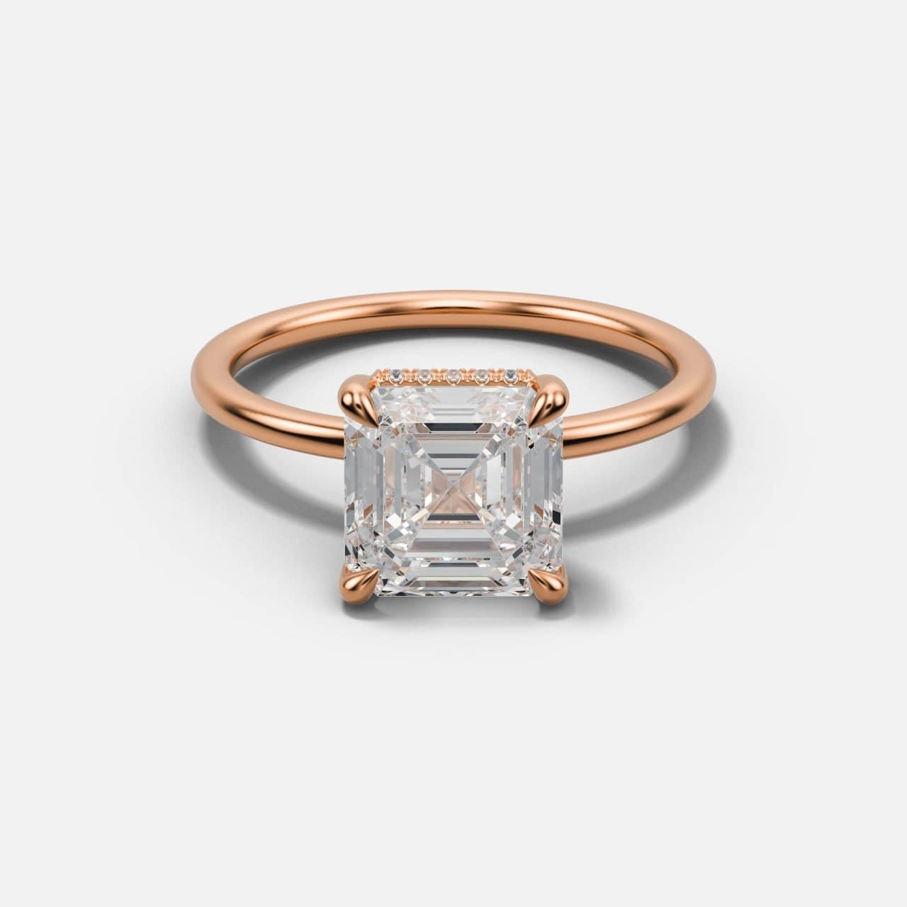
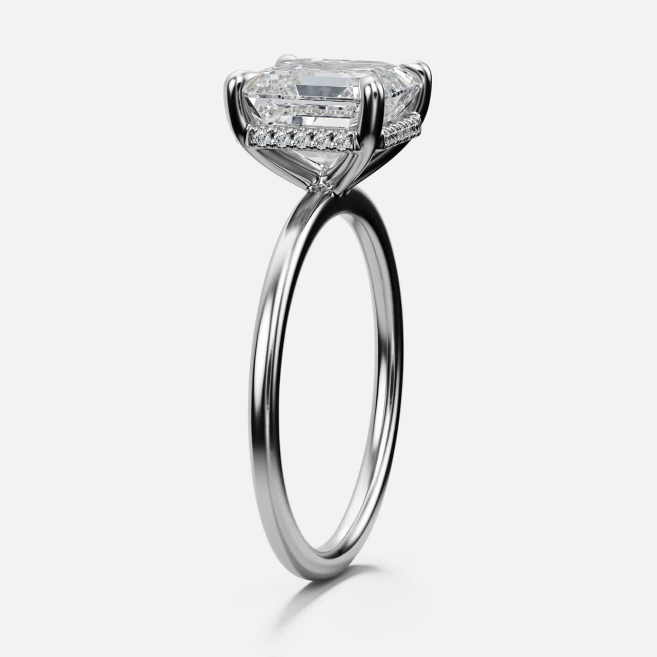
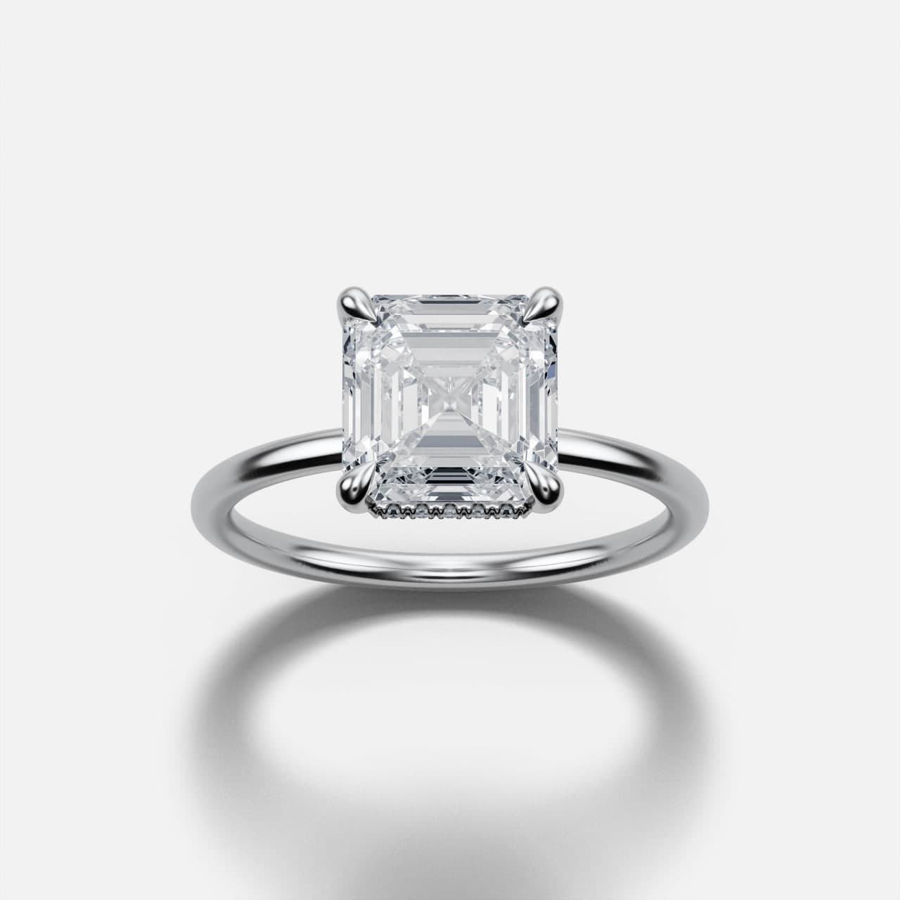
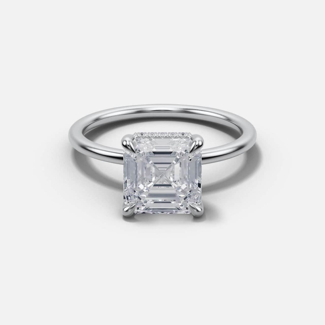
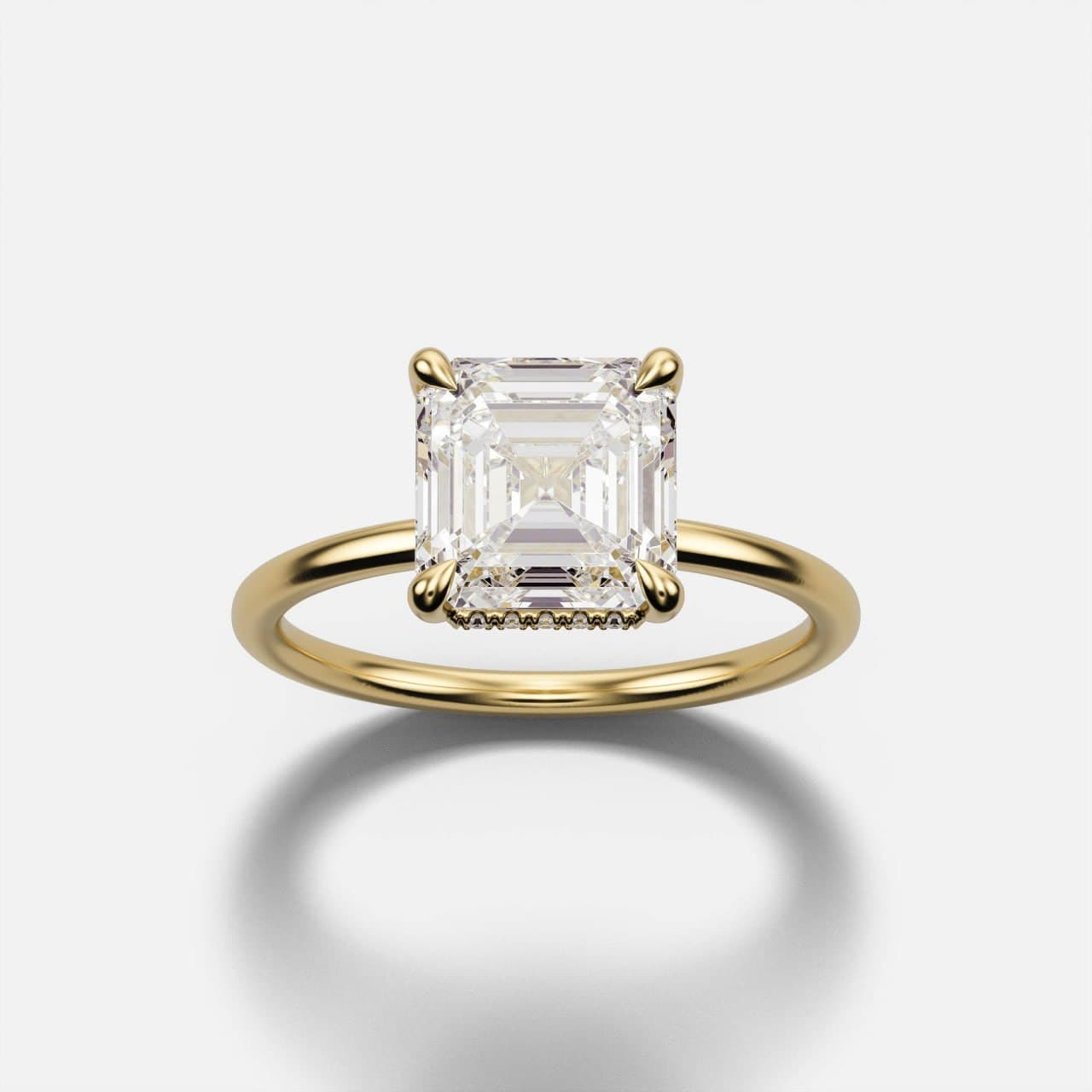
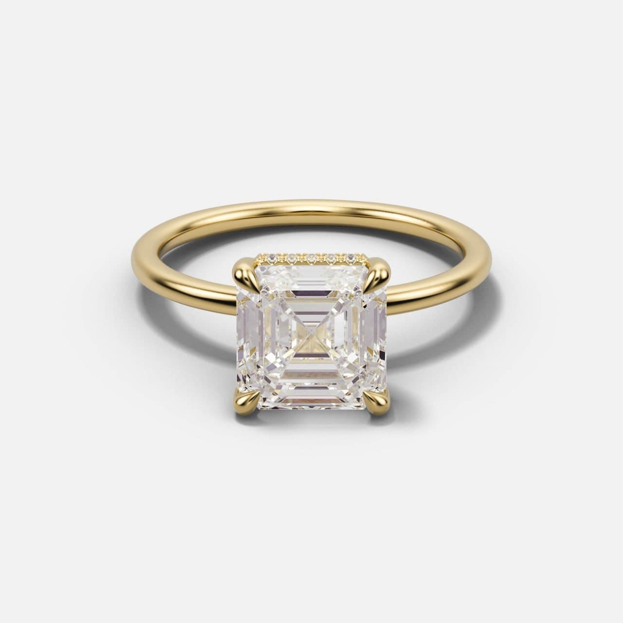
The emerald cut is rectangular, its long facets running parallel to the girdle, and it is carried here in double claws — two fingers to each corner, which spreads the load along the edges a step cut needs protected. The Asscher is square, with the corners cropped and the facets folding inward to a distinct X across the table, and it sits in single tapered claws that keep the outline of that square uninterrupted.
The result is a pair rather than two unrelated products. A brand can carry both, sell them as a family, and let the customer choose between elongation and symmetry without leaving the design language. That is a deliberate commercial structure, not a coincidence — and it is the same logic behind the thin-band, low-ornament direction the US market has been moving in.
| Emerald cut | Asscher cut | |
|---|---|---|
| Outline | Rectangular, elongated | Square, cropped corners |
| Facet behaviour | Long parallel flashes | Concentric, X across the table |
| Head shown here | Double claws | Single tapered claws |
| Reads as | Longer finger, art-deco calm | Symmetry, architectural |
| Shared | Knife-thin band, hidden halo | Knife-thin band, hidden halo |
Rose gold: the colour most often shown wrong
Rose gold gets its colour from copper, and the proportion of it is a recipe rather than a constant. Move the copper a little and the metal moves from a pale blush to something closer to bronze. That is a legitimate design choice — and it is also the single easiest way for a website to promise a customer one thing and deliver another.
This matters more than it sounds. A buyer choosing rose gold is usually choosing it specifically, often against a photograph they have looked at for weeks. If the render was tinted until it looked pretty rather than matched to the alloy the piece will actually be cast in, the ring that arrives is a different object from the one that was bought. That is a return, and worse, it is a review.
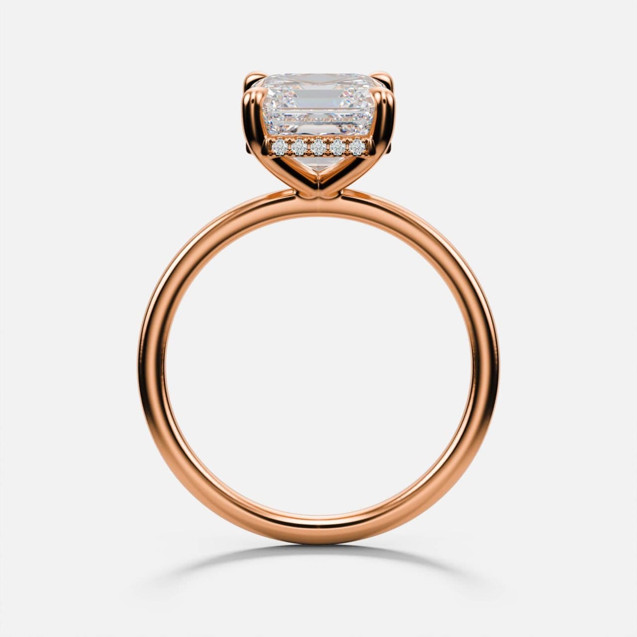
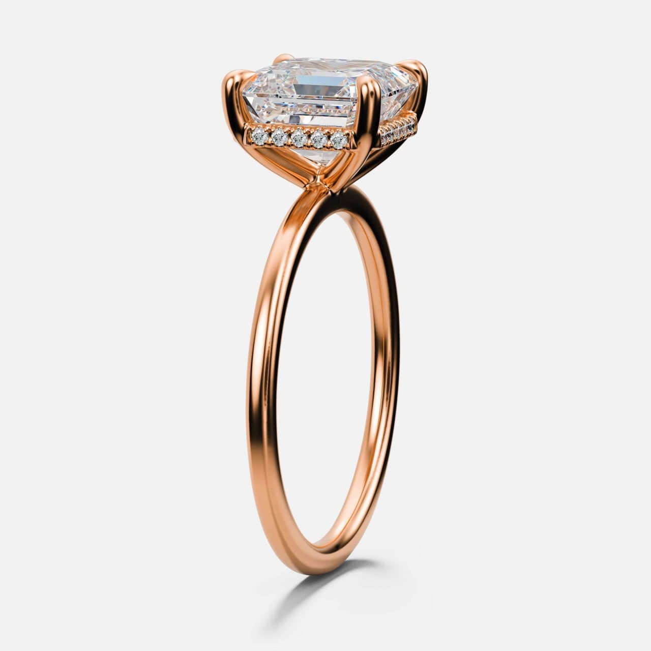
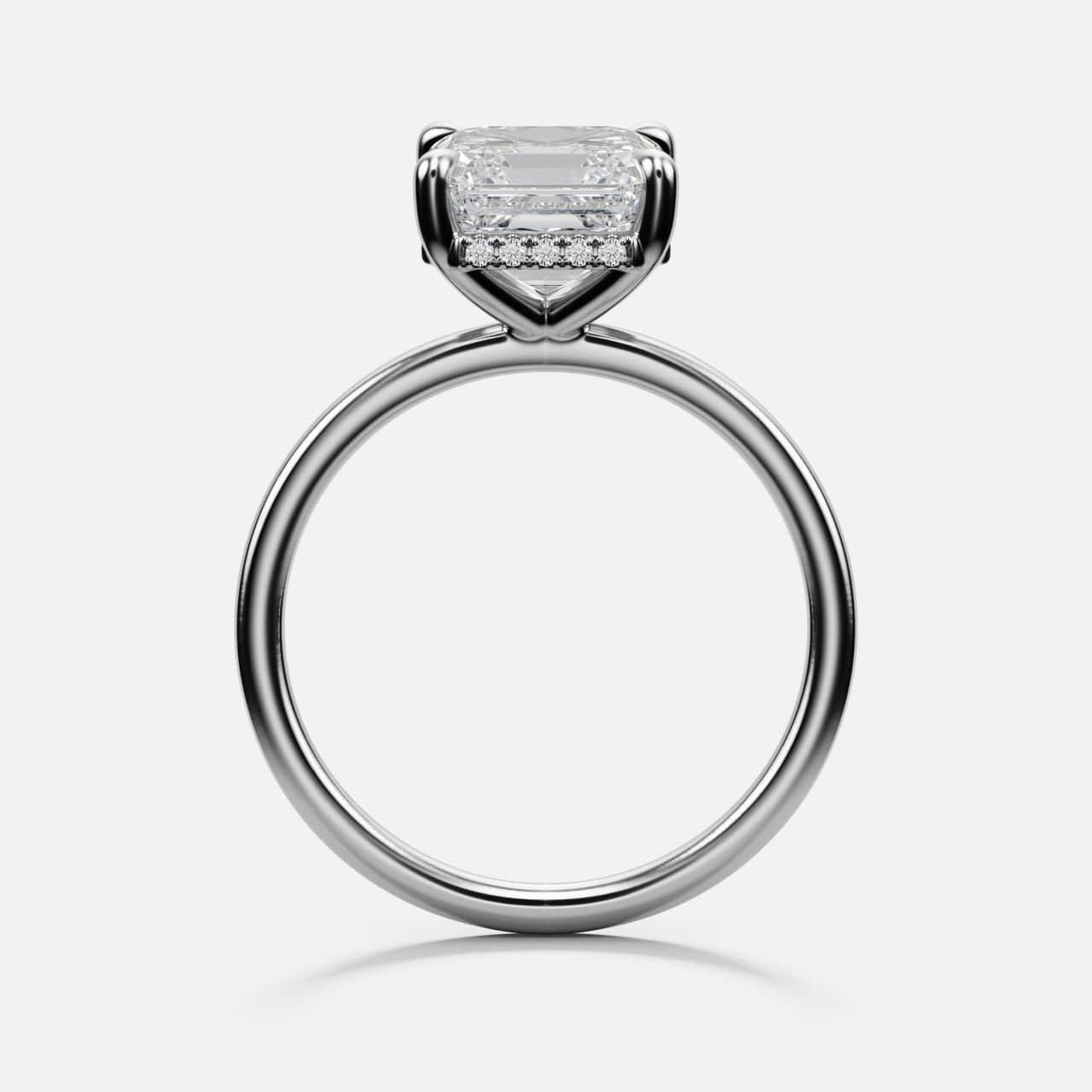
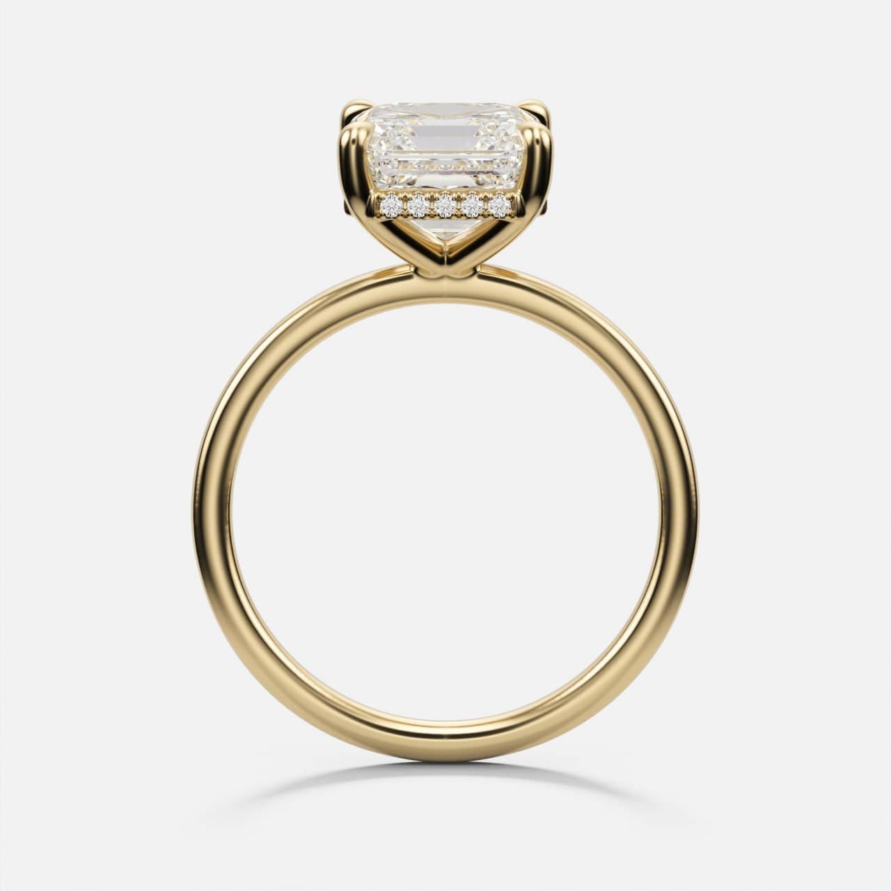
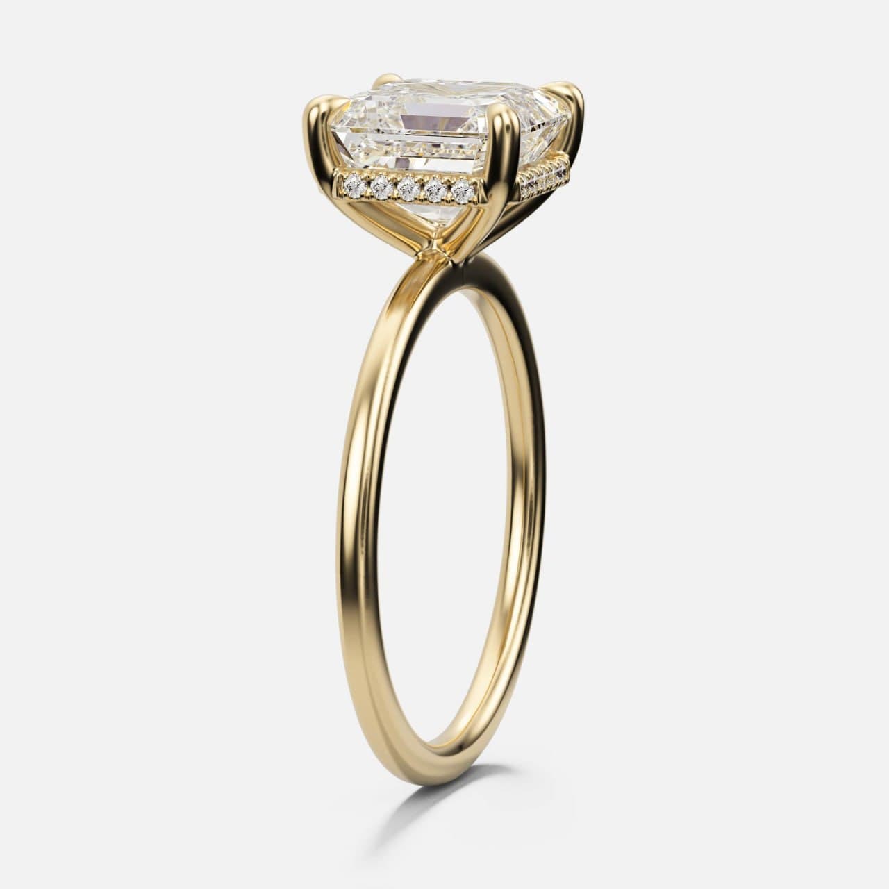
The two profile views below are also the clearest look at the concealed row of diamonds under each stone. It is invisible from directly above and unmistakable from the side — the detail the wearer knows is there, which is exactly the sort of thing that decides a luxury sale.
White metal: nothing to hide behind
White gold and platinum are the hardest metals to render convincingly, for a reason that has nothing to do with taste. A warm metal carries an image on colour alone — even a mediocre render of yellow gold reads as gold. A white metal on a light background has no colour to carry it. Everything the eye uses to identify it as metal is reflection: how sharp it is, how it falls off around a curve, how the shadow under the band holds together.
Get the reflectance wrong and white gold turns into grey plastic, or into polished aluminium, or into something that looks like costume jewellery photographed under a fluorescent tube. Nothing about the geometry has changed; the piece has simply stopped being believable. This is where physically accurate rendering stops being a description and starts being the whole job.
There is a second honesty question here. Most white gold is rhodium plated, which is what gives it the cool, bright white a customer expects; the metal beneath is warmer, and the plating wears. If a brand sells white gold, its imagery should show the plated finish it ships — and its product copy should say so.
Yellow gold: karat you can actually see
Fourteen and eighteen karat yellow gold are not the same colour, and the difference survives a phone screen. Eighteen karat is more saturated and noticeably warmer; fourteen is paler and slightly greyer, and it is also harder and cheaper. Both are legitimate products, and a catalogue that renders one and sells the other is quietly misleading its customers.
Warm metal does something else that a step cut makes obvious: it feeds colour back into the stone. Look along the pavilion of the emerald cut in the profile view and there is gold reflected in it. That is real, it happens in the metal, and a render that scrubs it out to keep the diamond looking icy is describing a ring that does not exist. Step cuts show this more plainly than brilliants, because their long facets act as mirrors rather than scattering light.
If the karat question is one your customers ask before they buy, it is worth answering in your own words — we wrote up how much gold is actually in an engagement ring for exactly that conversation.
Four views, and the job each one does
A product page does not need many images. It needs the right ones, in a fixed order, doing distinct jobs — so that a customer who scrolls all four has no questions left that an image could have answered.
- Same framing, same crop, same distance across every metal — so the range can be compared, not just browsed
- Square export, because it survives every marketplace and every grid without a second version
- One angle reserved for the detail the customer is paying for and cannot see head-on
- Enough resolution to zoom, since a step cut invites exactly that
| View | What it has to prove |
|---|---|
| Head-on | Outline, proportion, how the stone sits against the band |
| Three-quarter | The hero: stone, claws, band and hidden halo together |
| Profile | That the hidden halo exists, and how high the stone rides |
| Tilted | How the piece reads at an angle, the way a hand shows it |
Why this is two models, not two photo shoots
To photograph this set conventionally, all six rings have to exist. Two designs, cast three times each, set with real diamonds, finished, and shipped to a photographer — before a single customer has said they want one. For a capsule that may or may not sell, that is a large bet placed in the wrong order.
Built as CAD models, the sequence reverses. The geometry is authored once per design. Metals are a material assignment, not a manufacturing run, so three finishes cost a fraction of one sample. The catalogue goes live, the market answers, and only the pieces that sell are ever cast. If a stone size or a band width needs to change, it changes in the file and every image regenerates in agreement.
The same model is then the manufacturing model — it goes to print and casting rather than being a marketing prop that resembles the product. That is the part most brands underestimate: the imagery and the production file are not two deliverables, they are the same asset used twice. If you do not have a CAD department, that is the whole argument for offering custom design without building one.
What consistency actually requires
Consistency across a set is not a stylistic preference. It is the thing that tells a customer they are looking at one brand rather than a collection of things a brand happens to sell — and it is almost entirely invisible when it is done and glaring when it is not.
Concretely, it means the camera does not move between metals. The lighting rig is identical. The background is the same value on every frame. The crop is locked, so the rings sit at the same scale and a customer flipping between rose and white is comparing the metal and nothing else. Metal values are set from measured reflectance for the alloy, not adjusted by eye until the frame looks good in isolation.
It also means the model is production-honest before it is ever rendered: prongs that could actually be closed over a stone, a pavé row with real seats, wall thicknesses that survive casting. A render of a piece that cannot be made is a very expensive way to disappoint someone, which is why the geometry goes through the same checks it would need for printing and casting.
This is the part that has nothing to do with software and everything to do with process. Anyone can produce one good frame. A set of twelve that agree with each other, and with the metal that eventually arrives in the box, is a different discipline.
Start with one piece
The most useful way to judge a studio is not a portfolio — it is one of your own designs, put through the process, and compared against what you already sell. Send a sketch, a reference, or an existing CAD file, and we will build the model and the full image set for it.
You can see the range of work in the portfolio, read the step-by-step in how it works, and check the numbers on the pricing page — or on what CAD and rendering actually cost if you want the reasoning behind them rather than the figure. When you are ready, tell us about the piece.
Key takeaways
- A step cut hides nothing — the same long facets that make it beautiful expose a weak render instantly.
- Metal accuracy is a trust question, not an aesthetic one: rose gold alloy, rhodium plating and 14k vs 18k are all visible to the buyer.
- Four views — head-on, three-quarter, profile, tilted — answer every question an image can answer.
- One CAD model per design yields every metal, every angle and the production file, before a sample is ever cast.
- Consistency across a range is locked camera, locked lighting, locked crop — and it is what makes a catalogue read as one brand.
Frequently asked questions
What is the difference between an emerald cut and an Asscher cut?
Both are step cuts, with long flat facets running parallel to the girdle rather than the many small facets of a brilliant. An emerald cut is rectangular and elongated, which reads as a longer line on the finger. An Asscher is square with cropped corners, and its facets fold inward to a distinctive X across the table. They behave the same way optically — broad flashes rather than sparkle — but read very differently on a hand.
What is a hidden halo, and why show it in a separate image?
A hidden halo is a row of small diamonds set around the girdle of the centre stone, underneath it. It is invisible from directly above and only appears from the side, which is precisely why it needs its own profile view — a product page that skips that angle is selling half the ring.
Can a render really show the correct metal colour?
Yes, when it is built from measured reflectance values for the specific alloy rather than tinted by eye. That is the difference that matters commercially: 14k and 18k yellow gold are visibly different, rose gold shifts with its copper content, and white gold is normally rhodium plated. A render tied to the alloy you actually cast is what keeps the delivered ring matching the one the customer bought.
Do you need a physical sample before you can produce images?
No. The images come from the CAD model, so a design can be photographed, listed and sold before anything is cast. Most brands use this to test a collection against the market first and manufacture only what sells.
How many images does a jewelry product page need?
Four well-chosen views cover it for most rings: head-on, three-quarter, profile and tilted. Add a 360-degree turntable if the piece has detail that rewards rotation. What matters more than the count is that the same framing and lighting are used across every metal option, so a customer comparing finishes is comparing the metal and nothing else.
Further reading
Have a piece you need in 3D?
Fixed pricing, real-time tracking, manufacturing-ready files — delivered worldwide.
Request a quote